SurfTime.ru

Project Overview

Logo design for SurfTime.ru, a community hub and resource for surfing enthusiasts. Built around a dynamic, fluid typographic mark, the identity creates a recognizable presence across apparel and outdoor signage.

SurfTime.ru
Logo | Graphic Design
2010
Created
5
Concepts
Print
Platform

The Brief

An online surfing community needed an identity that could move from a digital web header into real-world applications. The founders wanted a logo that communicated the action and culture of surfing without generic beach clip art, and could work across merchandise, storefronts, and outdoor advertising.

The Approach

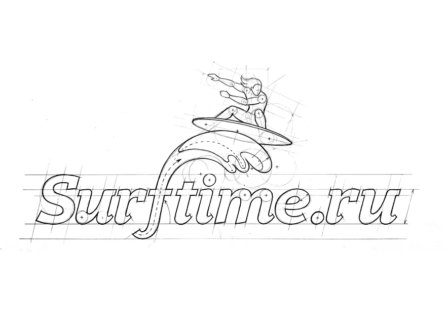
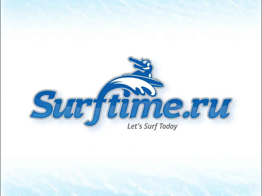
A bright aquatic blue evokes the sea. The hand-drafted mark integrates a stylized surfer riding a wave into the sweeping custom typography of “SurfTime.ru.” The slogan “Let's Surf Today” adds an inviting, actionable message.

The Outcome

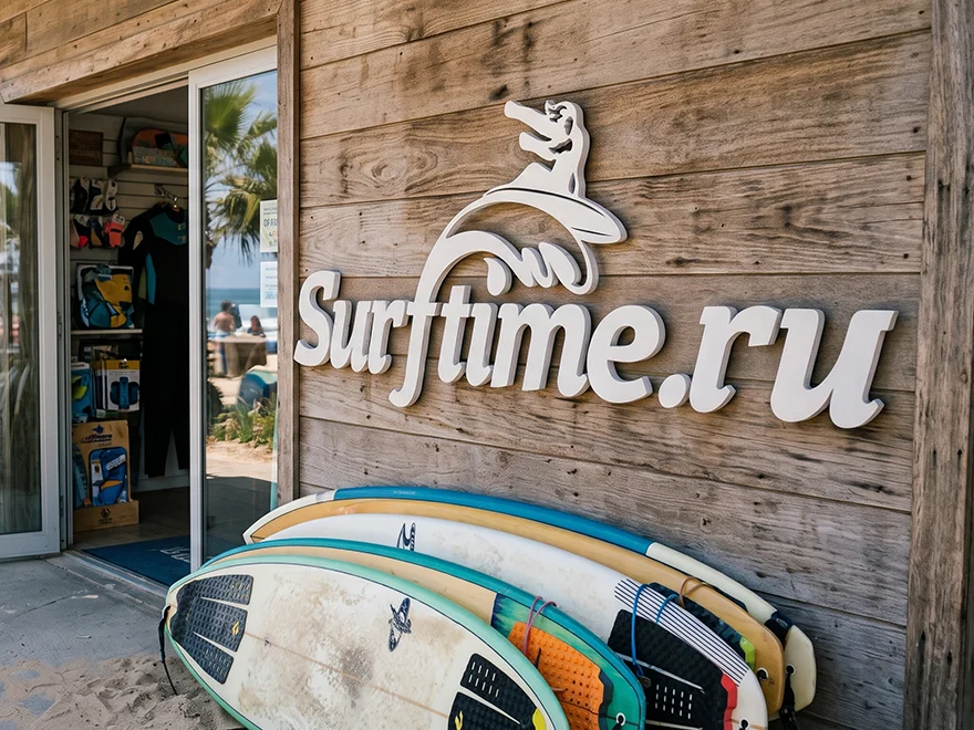
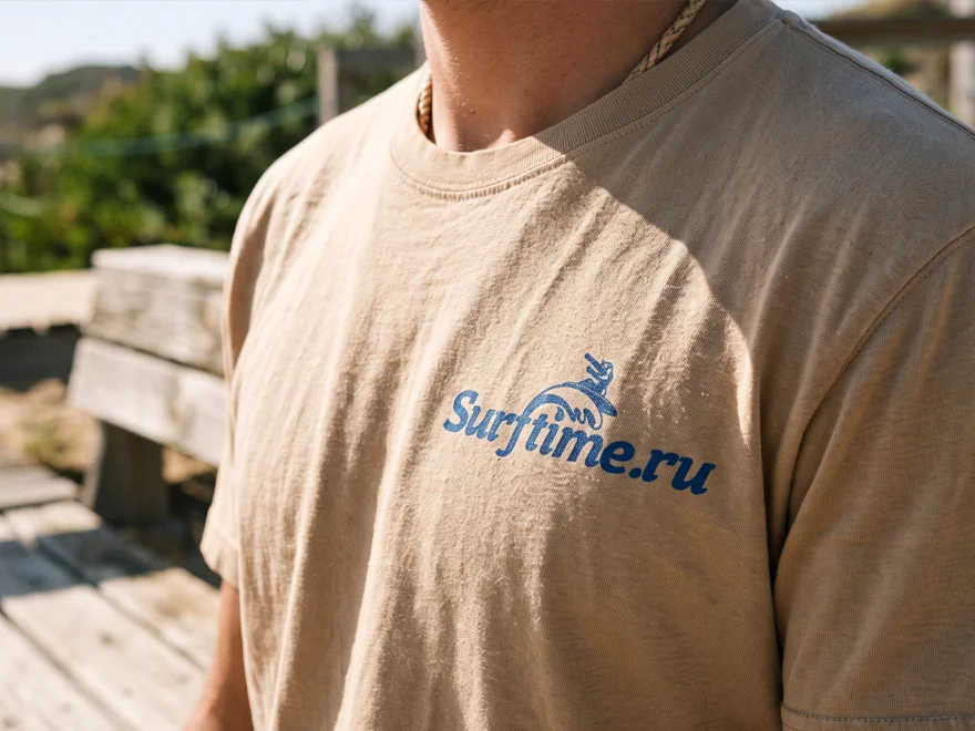
The identity gives the community a laid-back yet active look. Its bold, flowing lines stay legible as large 3D signage on a wooden surf shop, one-color artwork on a T-shirt, or a graphic on weathered coastal signage.

About Project

SurfTime.ru is a branding project for a surf-focused community. The goal was a playful but structurally sound logo that could work across the physical materials commonly found in surf culture.

The design process used precise geometric sketching to balance the organic wave and surfer forms with a legible URL. By weaving the surfer into the typography, the mark works as a single emblem rather than a separate icon and wordmark. The primary digital version uses subtle gradients, bevels, and shadows for a fresh, wet look.

The identity also adapts to physical settings: white 3D lettering sits naturally on rustic timber cladding above a surfboard rack, while simplified versions remain clear as one-color apparel prints or flat decals on outdoor signs. These variations keep SurfTime.ru recognizable wherever its community gathers.

More Projects